
The Power of Neutrals: How Beige, Cream, and Gray Define Modern Calm
In a world that often craves bold colors and dramatic statements, there's a quiet power in the simplicity of neutral tones. As the design landscape has evolved, the rise of beige, cream, and gray palettes has become a defining characteristic of modern, calming aesthetics. At CozyDecoHouse, we believe that the beauty of neutrals lies in their ability to create a sense of tranquility and sophistication within the home.
Understanding Neutral Color Theory
Neutral colors, by definition, are those that lack a strong hue or undertone. This includes shades of beige, cream, gray, white, and black. While these colors may seem unassuming at first glance, they possess a unique ability to work harmoniously together, creating a visually cohesive and serene environment.
The psychological impact of neutral tones cannot be overstated. Beige, for example, is often associated with comfort, warmth, and stability. Cream, on the other hand, evokes a sense of purity and lightness, while gray can convey a feeling of modern elegance and calm. By carefully selecting and combining these neutral shades, homeowners can craft spaces that are both visually appealing and emotionally soothing.
Layering Neutral Textures
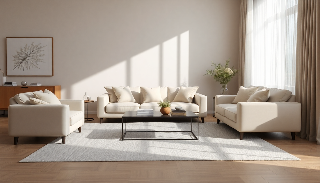
One of the key strategies in creating a successful neutral-based design is the intentional layering of textures. While a monochromatic palette may seem simple, the interplay of different materials and surfaces is what brings depth and interest to the space.
Imagine a living room where a plush, wool area rug is complemented by a linen sofa, a wooden coffee table, and a chunky knit throw. The varying textures create a sense of depth and visual intrigue, preventing the space from feeling flat or one-dimensional. This layering technique can be applied throughout the home, from the bedroom's soft, cotton bedding to the kitchen's smooth, ceramic tiles.
Practical Decorating Strategies
When it comes to decorating with neutrals, the key is to strike a balance between light and dark tones. A room that is entirely beige or gray can feel monotonous, while a space with too much contrast can appear jarring. The art lies in finding the right combination of shades that create a harmonious and visually appealing environment.
One effective strategy is to use lighter neutrals as the foundation, such as a creamy white wall color or a pale gray sofa, and then incorporate darker accents through accessories, artwork, or furniture pieces. This approach allows the space to feel airy and open, while the darker elements add depth and visual interest.
Additionally, it's important to consider the undertones of the neutrals being used. A warm beige, for example, will have a different effect than a cooler, greige tone. Paying attention to these subtle differences can help homeowners achieve the desired aesthetic and ensure a cohesive look throughout the space.
Room-by-Room Neutral Design
The beauty of a neutral color palette is its versatility. It can be seamlessly incorporated into any room of the home, creating a sense of tranquility and sophistication.
In the living room, a neutral scheme might feature a plush, beige sofa, complemented by gray accent chairs and a natural wood coffee table. Layered textures, such as a jute rug and linen throw pillows, add depth and visual interest.
Moving to the bedroom, a serene oasis can be created with a cream-colored duvet, soft gray sheets, and a wooden headboard. Accents of white, through a sheer curtain or a ceramic lamp, help to brighten the space and create a sense of lightness.
In the kitchen, a neutral palette can be achieved through the use of natural wood cabinetry, paired with a neutral-toned backsplash and countertops. Pops of greenery, such as a potted plant or fresh herbs, can add a touch of life and contrast to the space.
The Benefits of a Neutral Color Palette
Embracing a neutral color palette in home design offers a multitude of benefits. Firstly, neutral tones are inherently timeless, allowing homeowners to create a space that will remain stylish and relevant for years to come. Unlike trends that come and go, a neutral-based design can easily be updated with new accessories or minor changes, without the need for a complete overhaul.
Moreover, neutral spaces have a calming and stress-reducing effect on the mind. In a world that is often filled with visual stimuli and constant distractions, a neutral-toned home can provide a much-needed respite, a sanctuary where the senses can find peace and tranquility.
Conclusion
As the design world continues to evolve, the power of neutral colors in creating modern, calming environments has become increasingly apparent. At CozyDecoHouse, we believe that the beauty of neutrals lies in their ability to foster a sense of serenity and sophistication within the home.
By understanding the color theory behind neutrals, layering textures, and employing practical decorating strategies, homeowners can craft spaces that are both visually appealing and emotionally soothing. Whether it's a cozy living room, a tranquil bedroom, or a serene kitchen, the versatility of a neutral palette allows for endless possibilities in creating a home that truly reflects one's personal style and values.
So, embrace the power of neutrals and let CozyDecoHouse guide you on your journey to crafting a space that embodies the essence of modern calm.